JLT Solar PH is a solar company that aims to provide services related to the installation, maintenance, and repair of solar panel systems for residential and commercial customers.
Logo Design
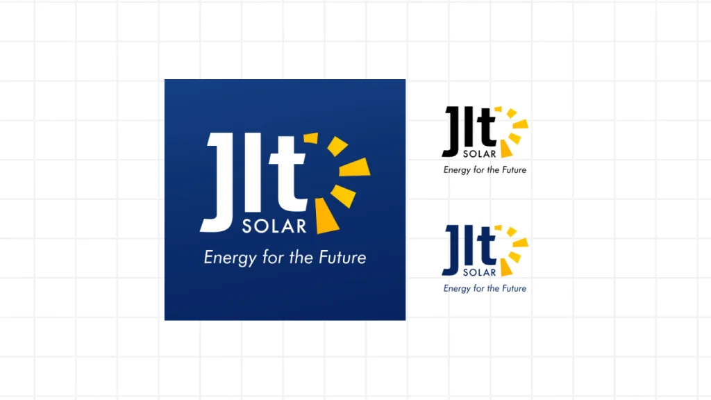
The logo design strategically incorporates the company’s core values and messaging for its customers. Furthermore, I simplified the logo and showcased the company name so that potential customers can easily remember it. The addition of sun rays visually emphasizes the company’s services. Finally, I included a tagline to further communicate the brand’s focus and strengthen brand recognition.
To learn more, check out my post on Behance for this logo design.


Brand Colors
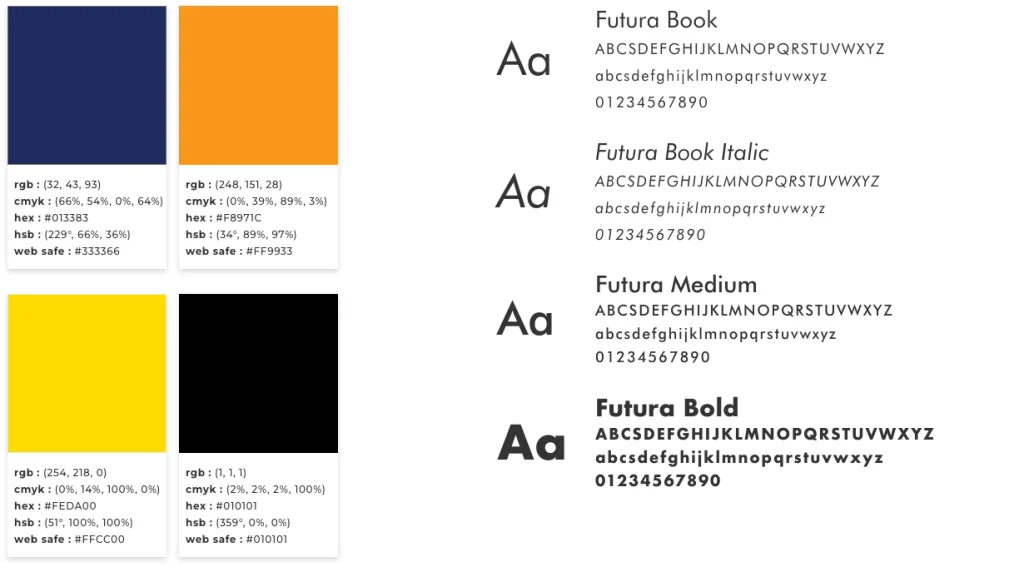
The brand palette for JLT Solar focuses on reliability, professionalism, and positivity. The dark shade of blue reflects stability with the reference of the solar panels. The secondary color, orange, communicates energy and intensity with reference to the sun. A set of guidelines was created for consistent and cohesive visual and written content for the marketing collaterals.

Print Design
To ensure brand consistency, designing print marketing materials demands a deliberate approach to the company’s branding. This means actively selecting graphics, fonts, images, colors, and layouts that reinforce the brand’s identity and messaging. The calling card design strategically presents the advantages of solar panels to attract customers and prominently displays the company’s contact information for easy outreach.

Social Media
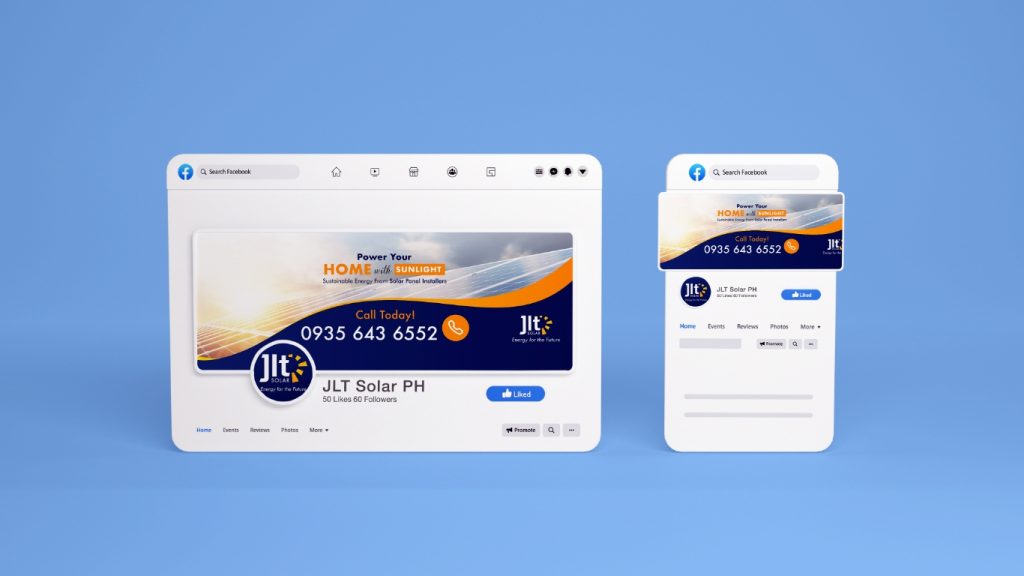
Different social media platforms have unique content needs. I customize each post to suit the platform while keeping the brand’s visual identity and keeping the message consistent. To ensure consistent naming, we created a Facebook page and supplied a template as a reference for future Facebook social media graphics.

